Redefining Uplevel's Brand and Website
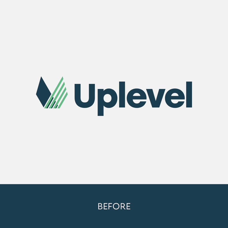
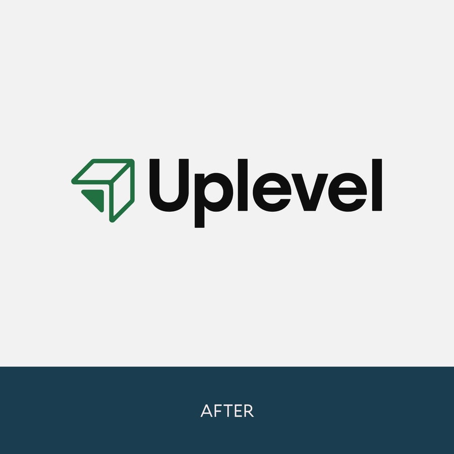
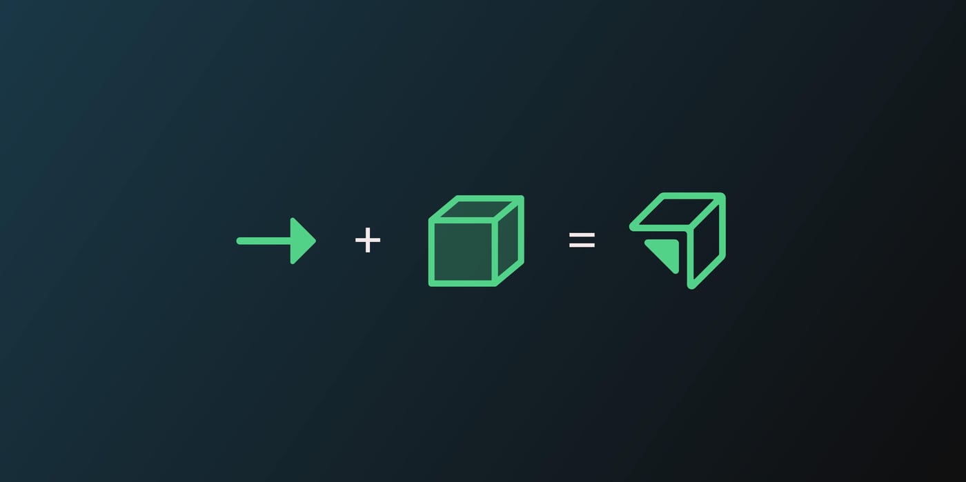
Our collective objective for this project was twofold: to invigorate and elevate the existing brand identity while also introducing fresh elements inspired by previous logos. This endeavor aimed to imbue the brand with renewed vitality and a modern sensibility. To achieve this, we worked closely with Uplevel's internal team, contributing to brand strategy, website design, and development.
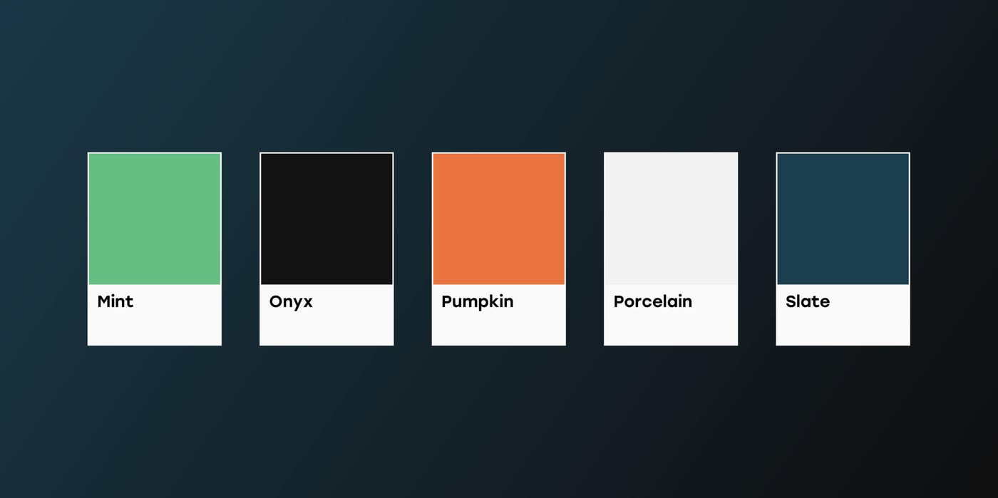
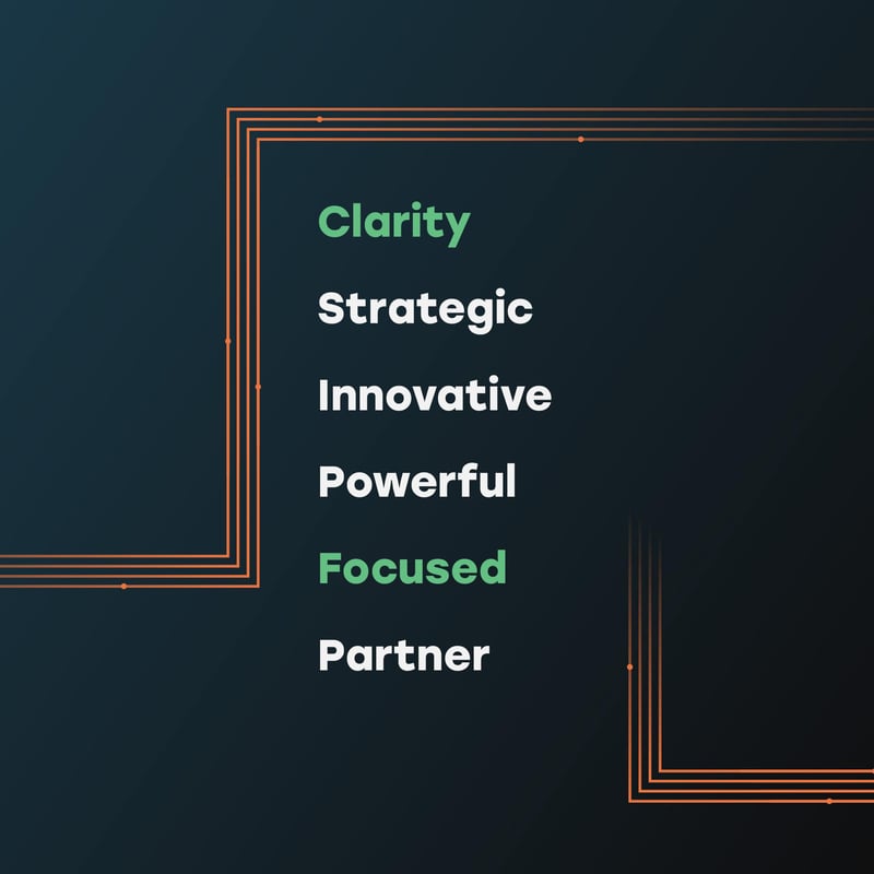
The visual language we crafted for Uplevel was guided by the core values of clarity, innovation, strategy, and focus. We harnessed dramatic colors and depth to convey a sense of forward movement and growth. Bright, contrasting colors and bold typography contributed to a dynamic aesthetic that spoke to the brand's cutting-edge nature.
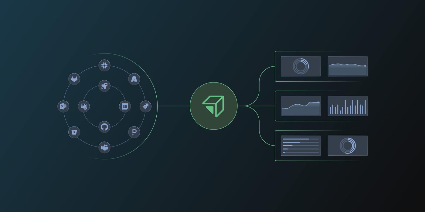
Additionally, we developed custom icons and infographics that seamlessly integrated with the brand, reinforcing key concepts and enhancing the overall visual narrative.

Our approach to the Uplevel project was deeply collaborative and iterative. The client came to us with a vision and thorough research, and our mission was to become true partners and an integral part of their team. We engaged in frequent meetings to align our efforts and chart a clear direction for the brand, ensuring that every step of the journey was a dynamic and productive partnership.
