The Brand
The Digital Custodian is a coaching service that helps teams clean, improve, and maintain their team processes. Working primarily with software development teams, the approach is borrowed from multiple techniques to implement realistic and measurable solution
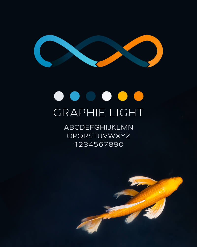
The logo represents the power of the 3 steps “Clean. Improve. Maintain.” as well as the cyclical nature of the iterative process. The triple infinity symbol represents movement, unity and continuity.

Typography and Colors
The type treatment is simple and modern. For a consultant that is coming into a business and working with others we wanted to establish an air of wisdom and polish but not be over-pretentious, so we went with a crisp, geometric typeface.
The colors are inspired by koi ponds, a nod to the Japanese business method Kaizen, a philosophy of continuous improvement.
Website Design & Website Development
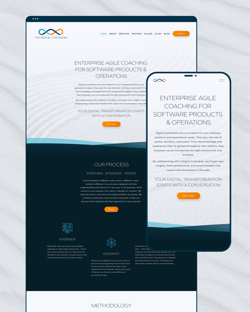
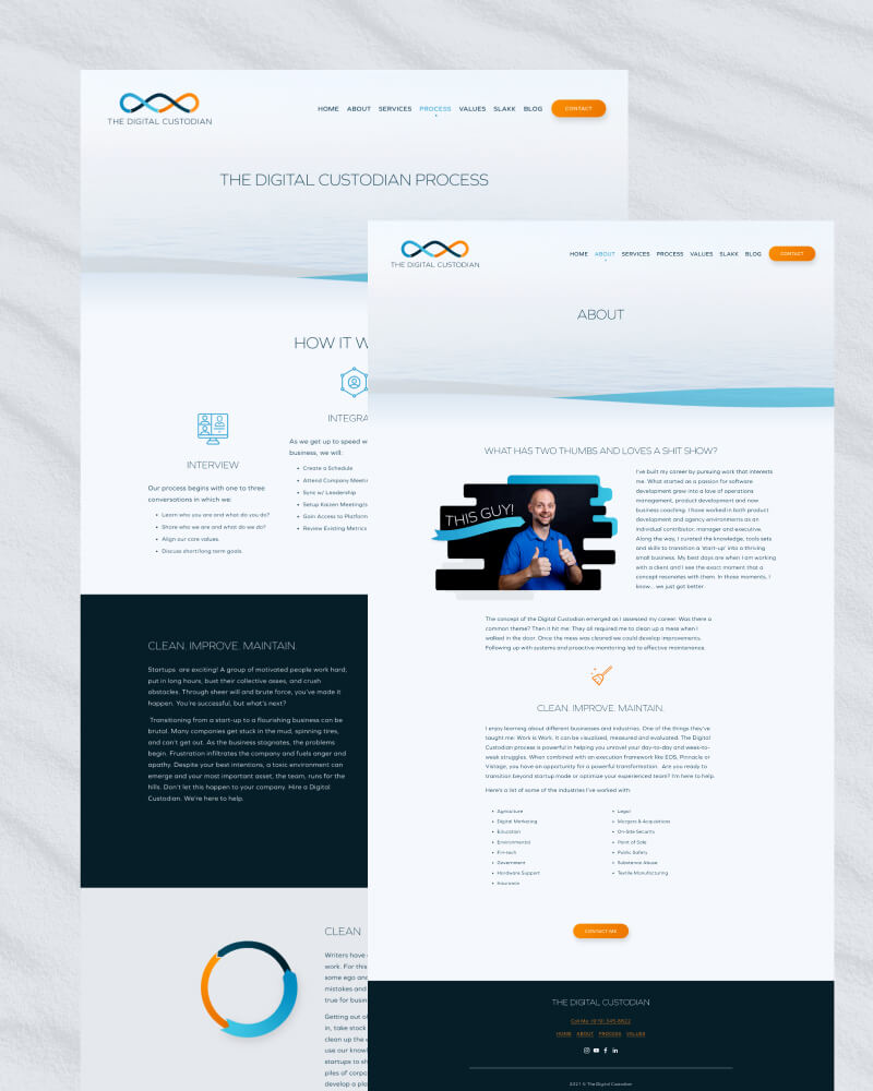
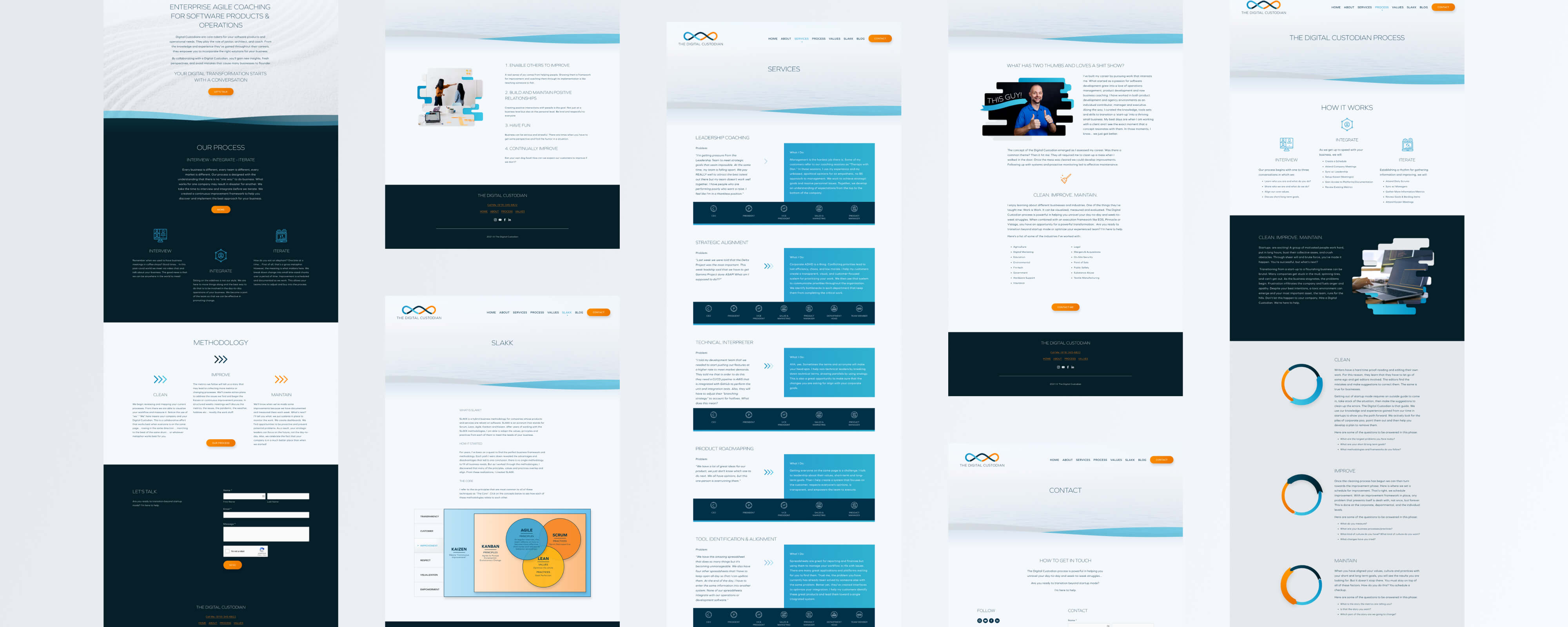
The website was a continuation of the brand, focusing on a calming, zen concept.
