Sunny Shade Up
SunnyShadeUp
A bright new identity
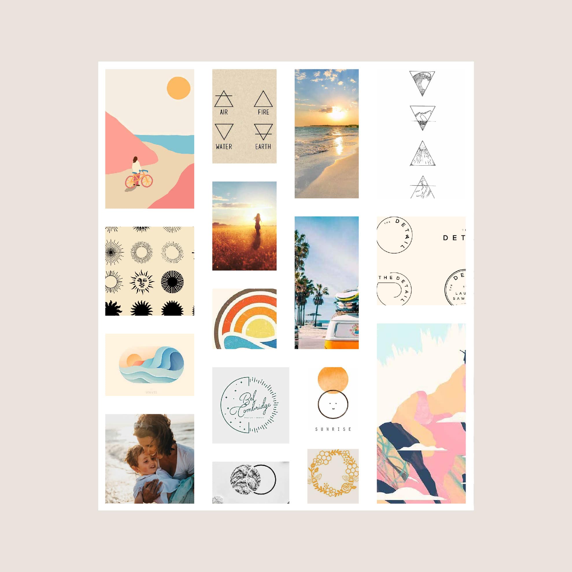
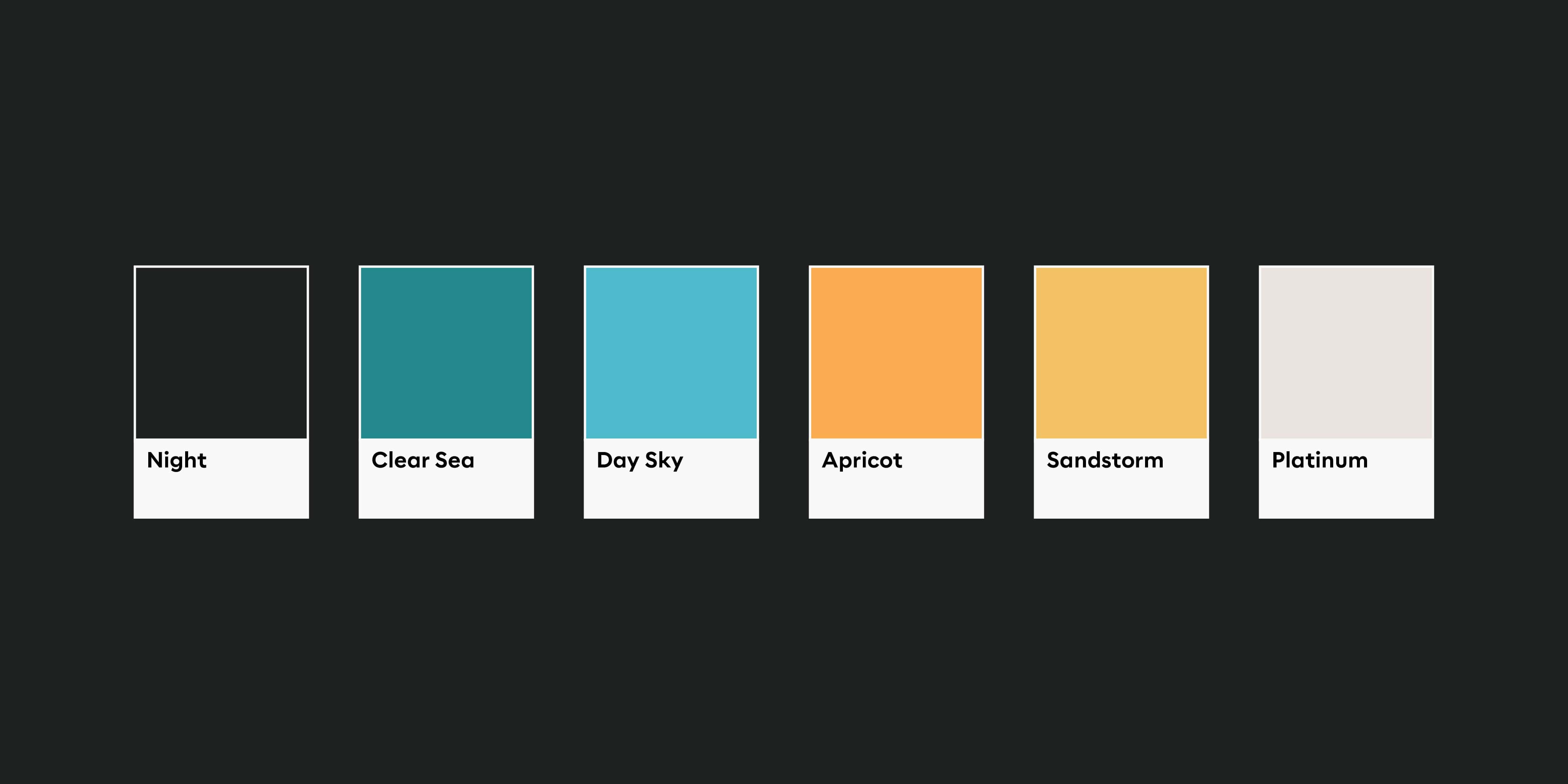
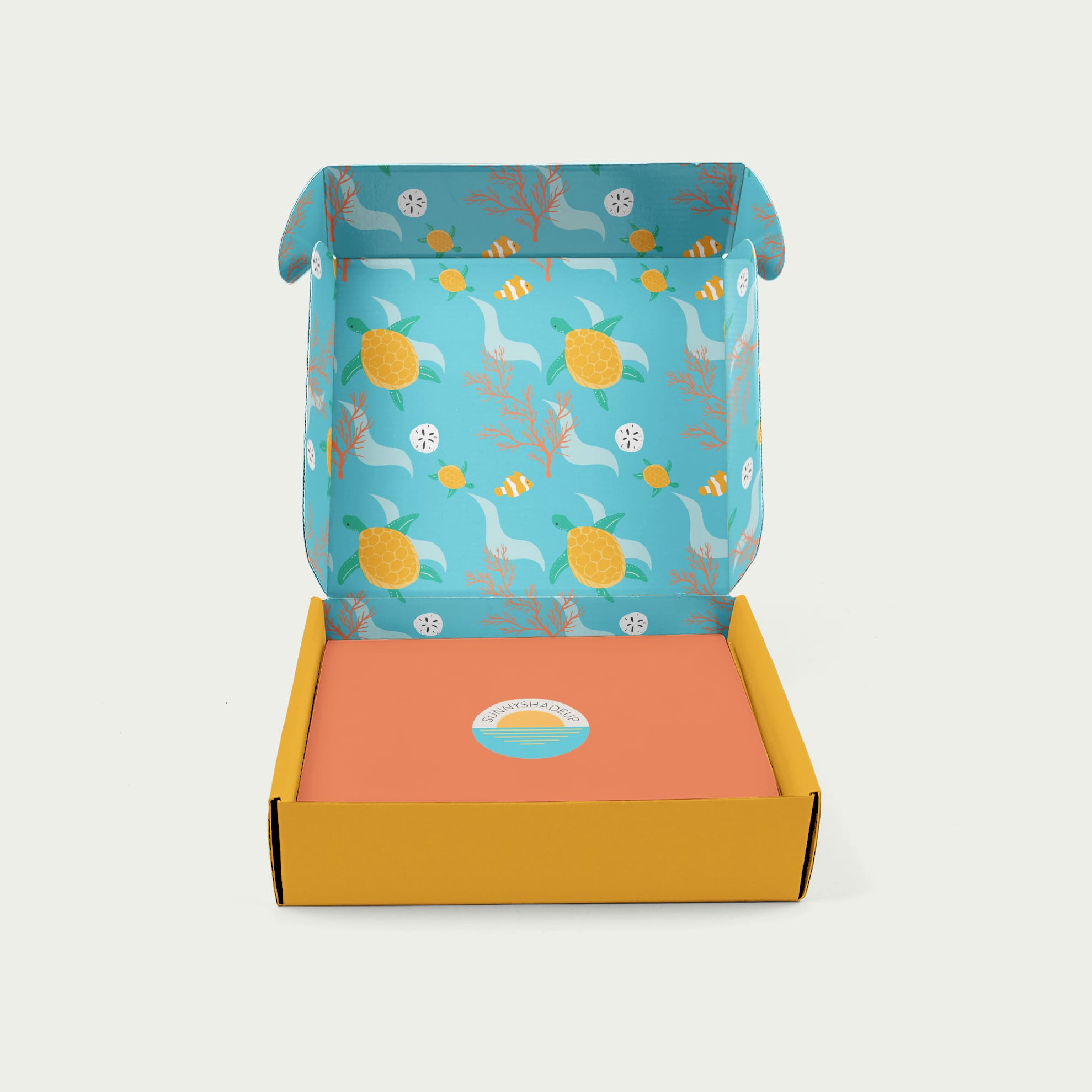
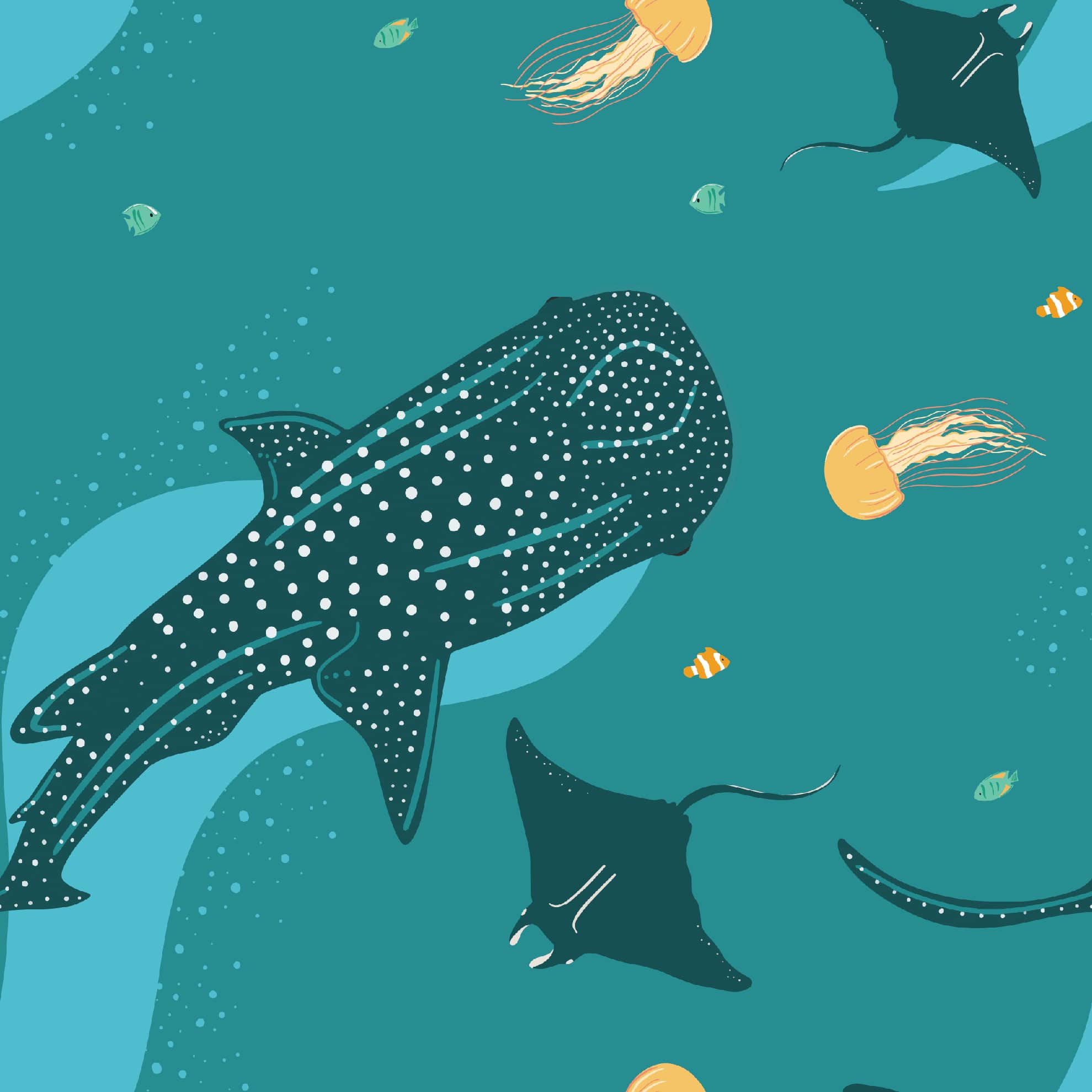
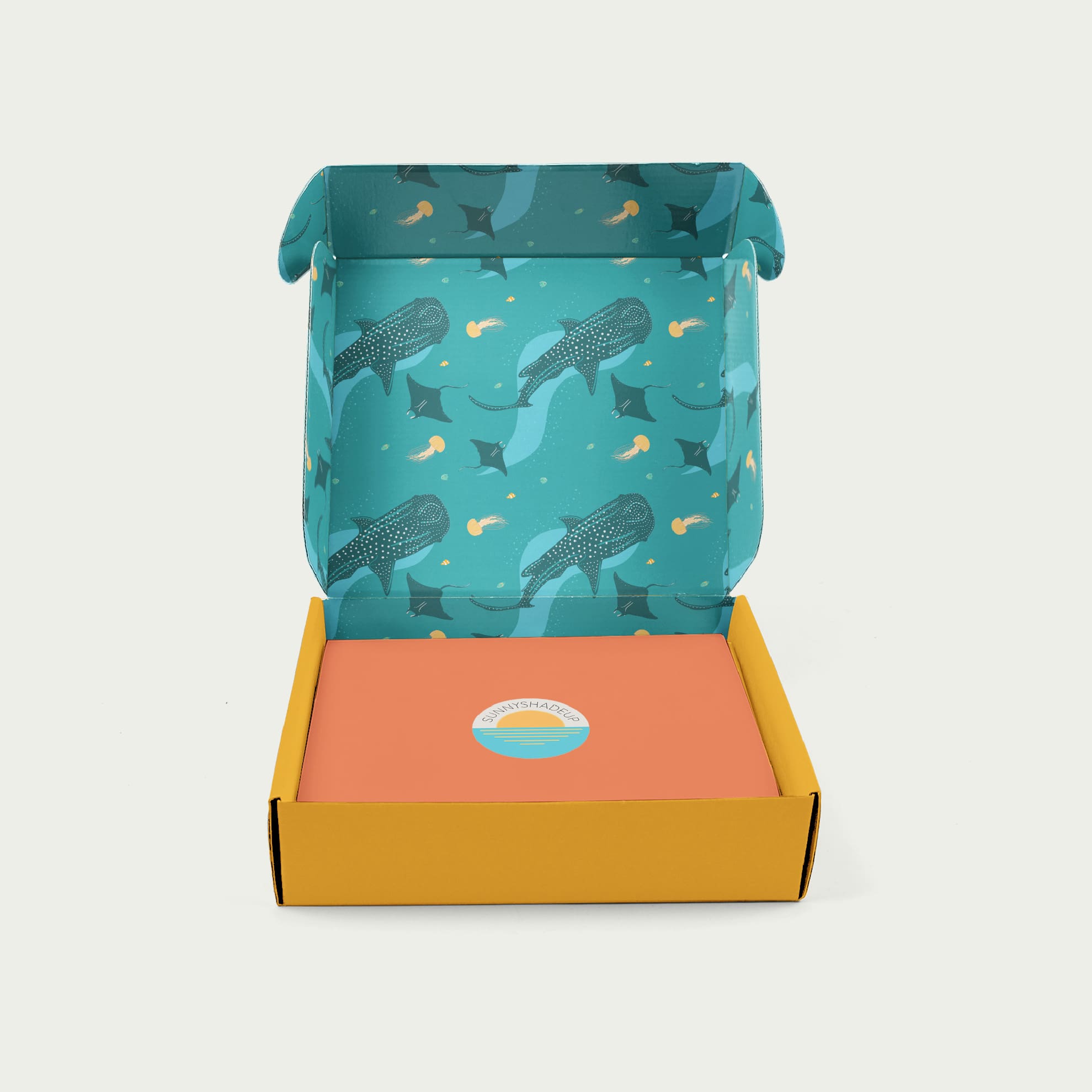
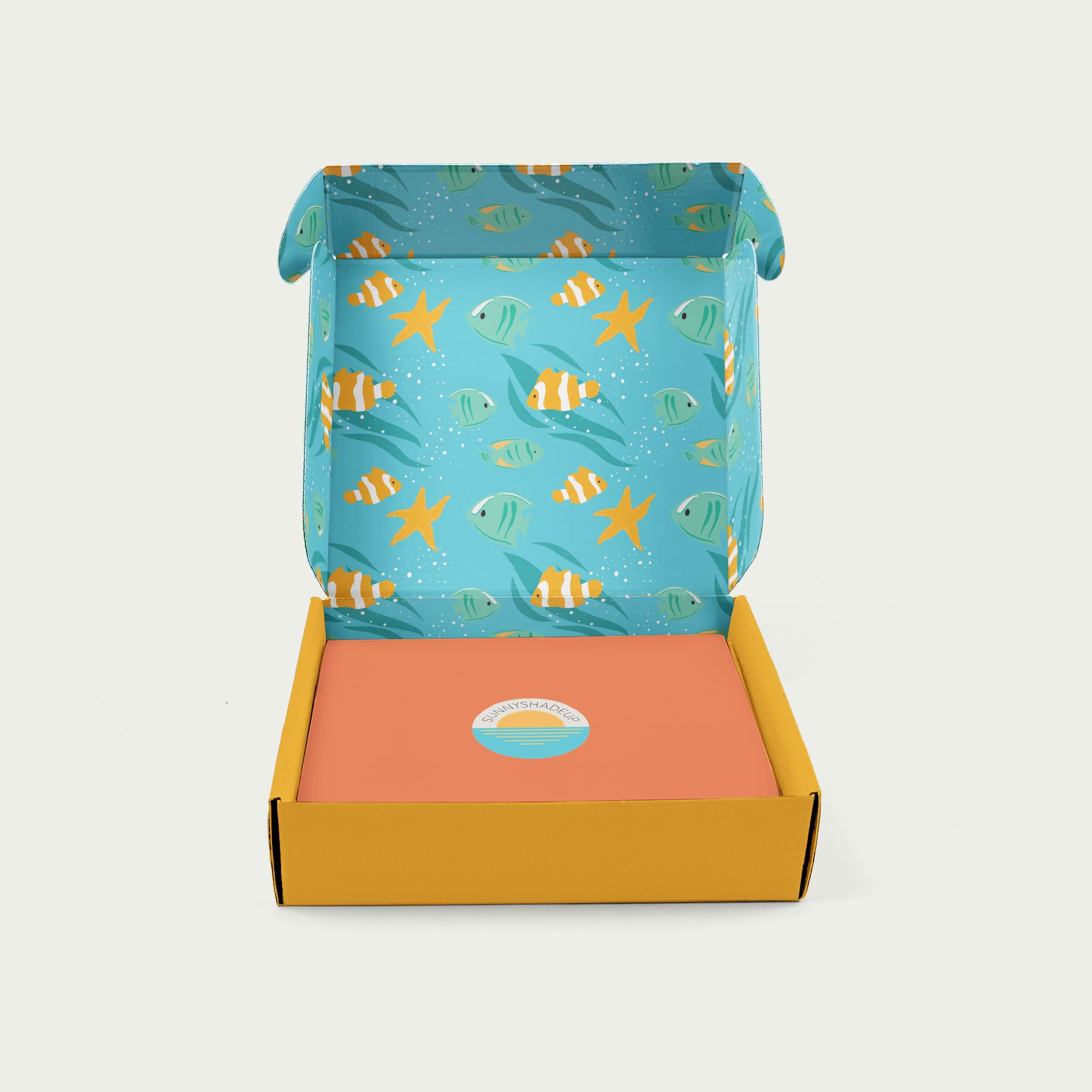
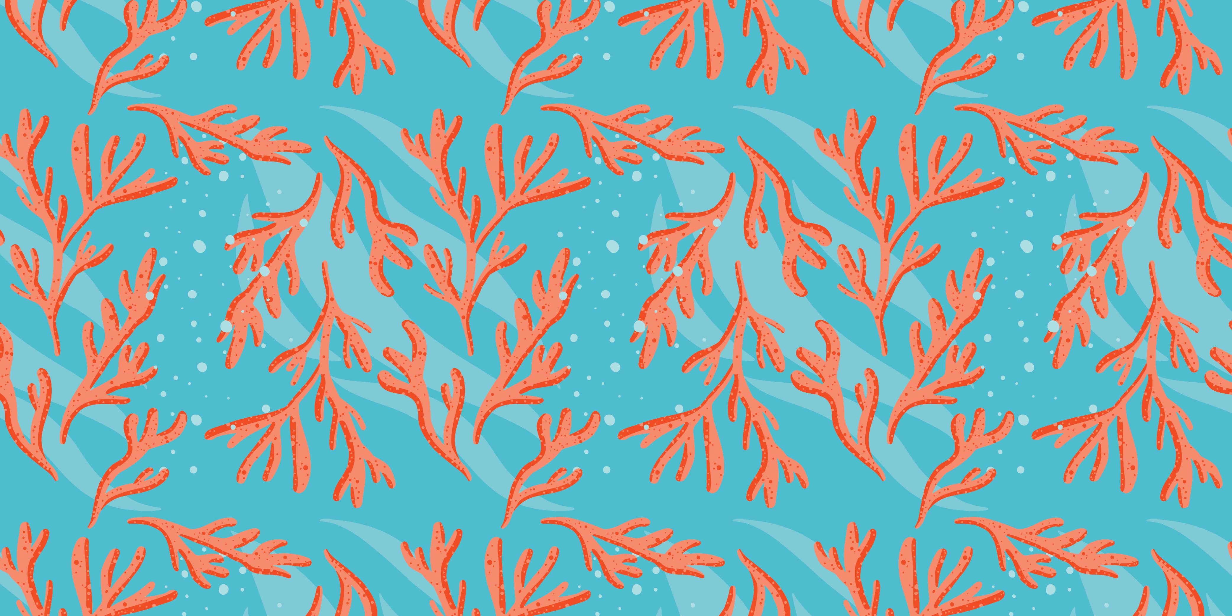
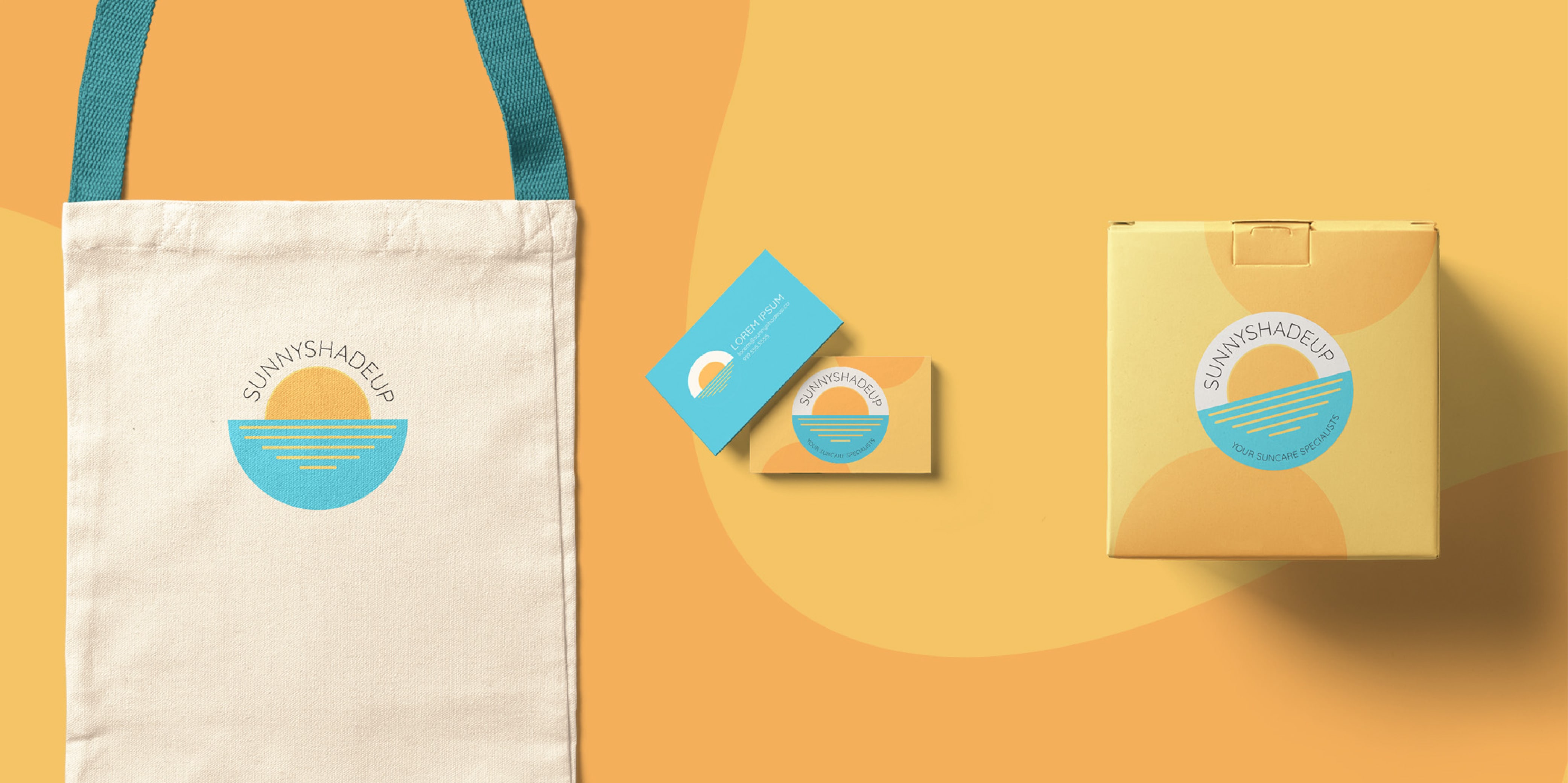
Our packaging design for SunnyShadeUp emphasized brightness, mirroring the brand's vibrant identity. Inside the product mailer boxes, we incorporated patterns featuring undersea life impacted by toxic chemicals and ocean pollution. This reinforced the notion of sun care with minimal environmental impact. Opening a SunnyShadeUp package should be a delightful experience, akin to the excitement of receiving a special delivery in the mail.
Alternate Takes
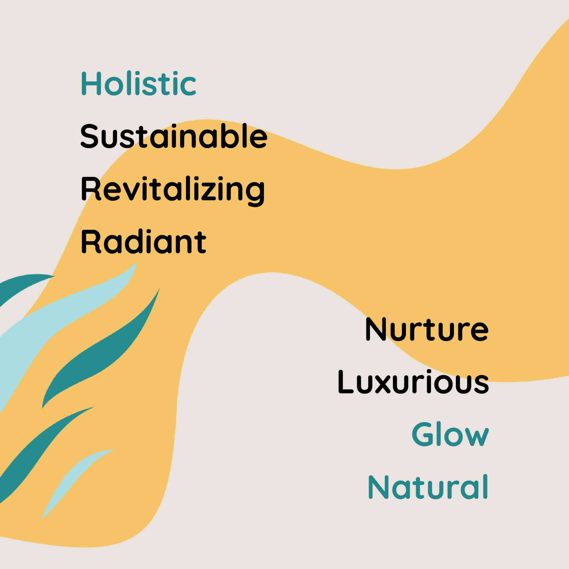
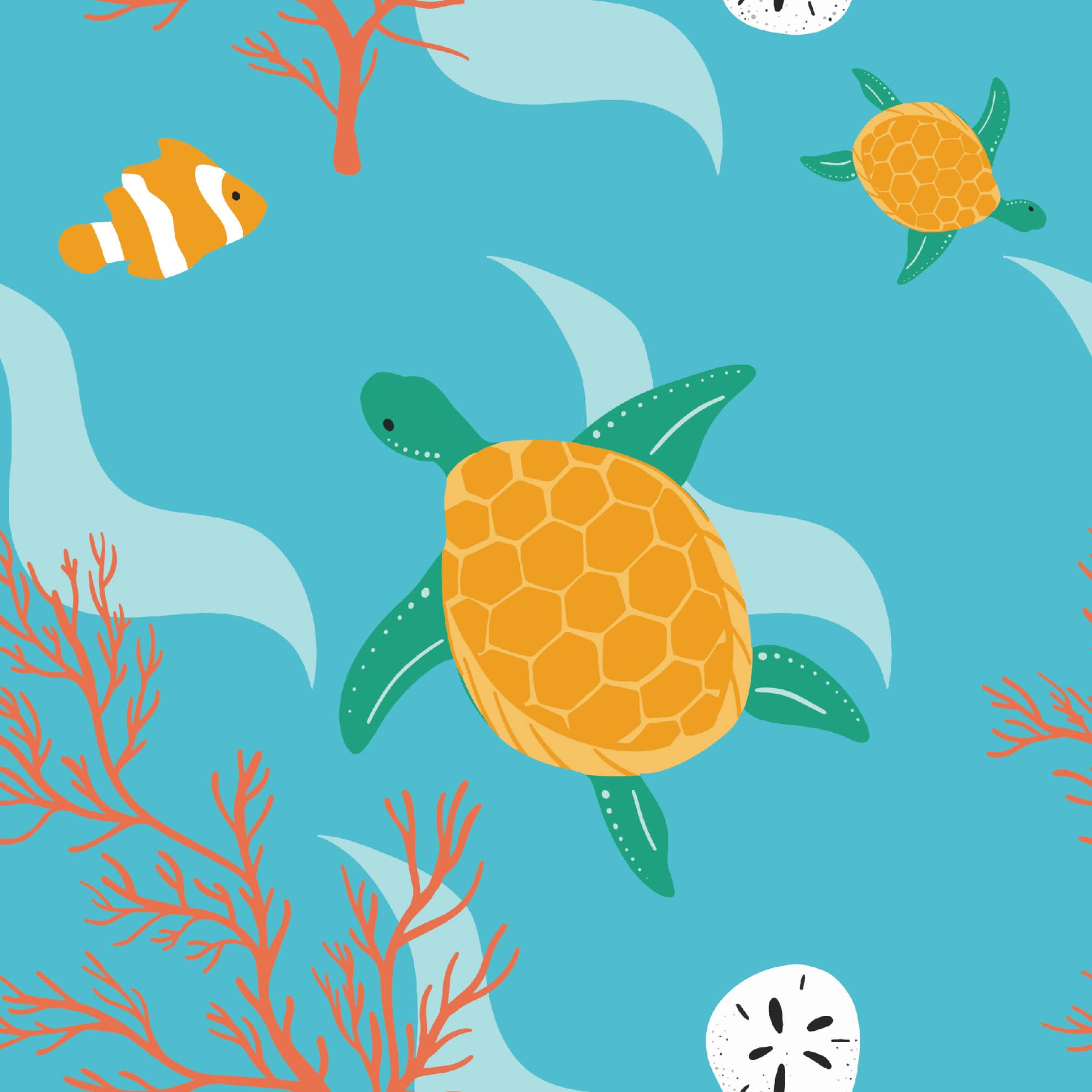
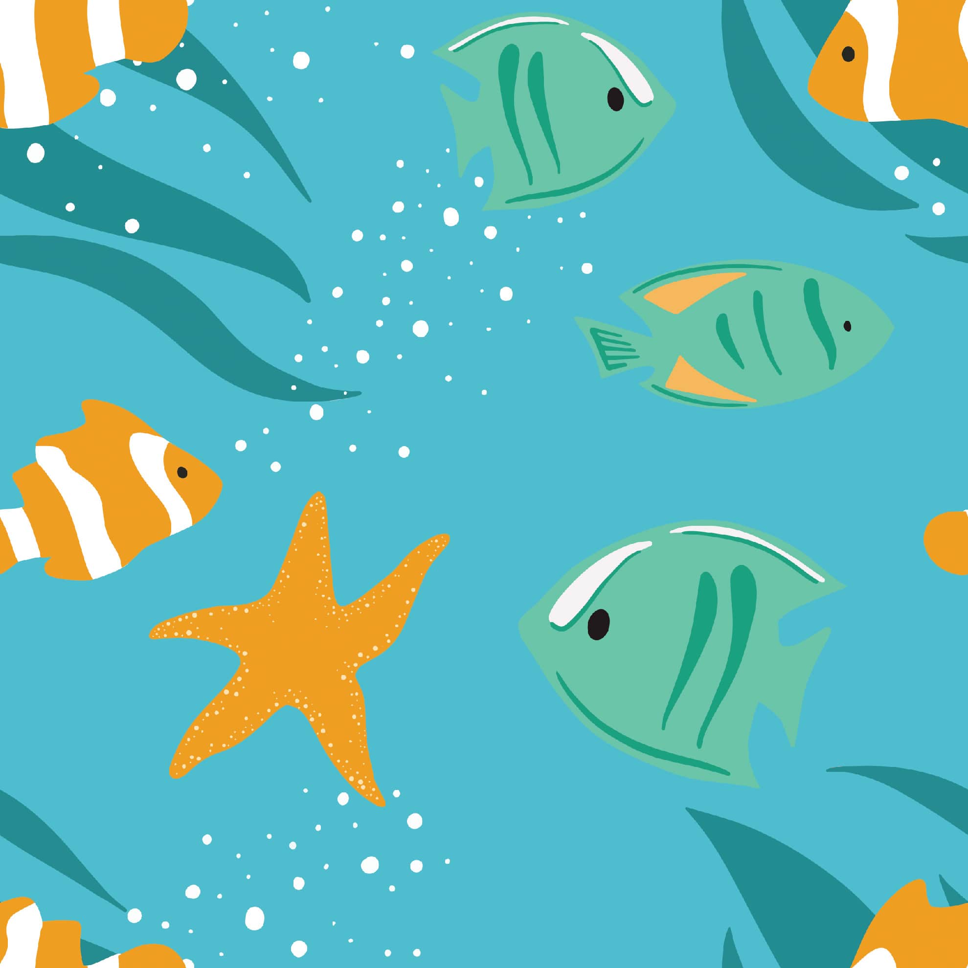
As part of the packaging project, we developed charming patterns inspired by beach days and marine life. These patterns not only capture the joy of a day at the beach but also communicate the importance of using eco-conscious sun care products to protect the beaches and ocean wildlife we treasure. Pre-made patterns provide versatility in products and future designs, adding visual interest while incorporating brand colors. Some personal favorites include patterns featuring whale sharks swimming alongside jellyfish and vibrant coral.
Our website design aimed to echo the bold, cheerful colors and playful shapes of the sea and sun. The primary focus was on providing customers easy access to the sun care products they needed for a safe outdoor experience. We wanted the website to be light, fun, and carefree. An essential challenge was creating an e-commerce website swiftly in time for summer. To meet this goal, we opted for a custom Squarespace theme, leveraging its user-friendly setup and extensive features. Notably, the client can effortlessly edit content and add products. Additionally, we ensured the site's scalability over time and growth, incorporating a blog feature and a mailing list to accommodate future business endeavors.