RDUSBG

Branding
ourwork-usbg-header

Raleigh-Durham United States Bartender’s Guild Logo Design

The Raleigh Durham USBG  Branding project presented a unique challenge: merging symbolism from two distinct cities along with elements from the world of bartending. This branding captures the dynamic essence of bartending—a realm of constant motion and creativity. Our goal was to reframe the conventional imagery associated with these cities while infusing it with a fresh perspective. 
ourwork-usbg-typography01
ourwork-usbg-typography02

Our approach to the RDUSBG branding was to encapsulate the energy of bartending and the spirit of collaboration between Raleigh and Durham. The use of lively colors and dynamic design elements reflects the vibrancy of this unique partnership. We wanted to create an identity that not only represents the RDU branch of the US Bartender's Guild but also celebrates the coming together of these two distinct communities.

ourwork-usbg-creative01
ourwork-usbg-creative02
ourwork-usbg-logo01
ourwork-usbg-logo02
ourwork-usbg-coasters
ourwork-usbg-promo01
ourwork-usbg-promo02
ourwork-usbg-promo03

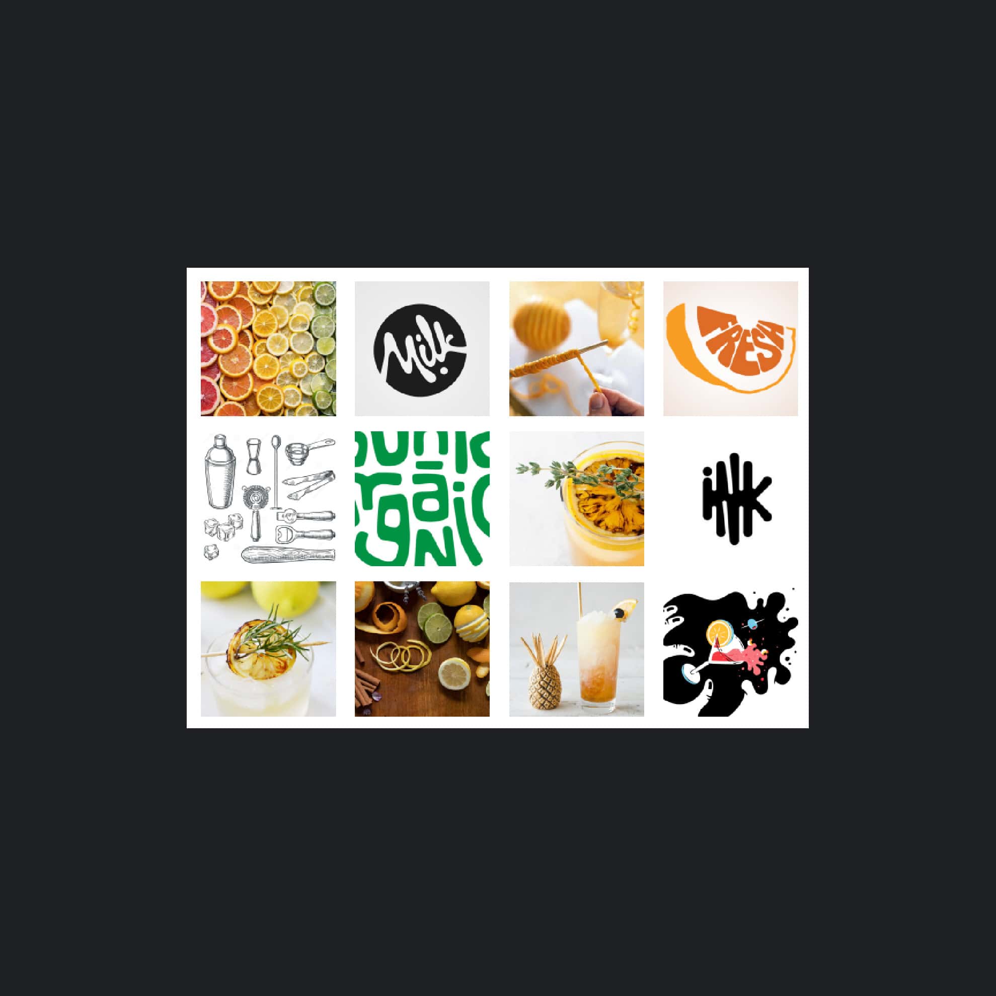
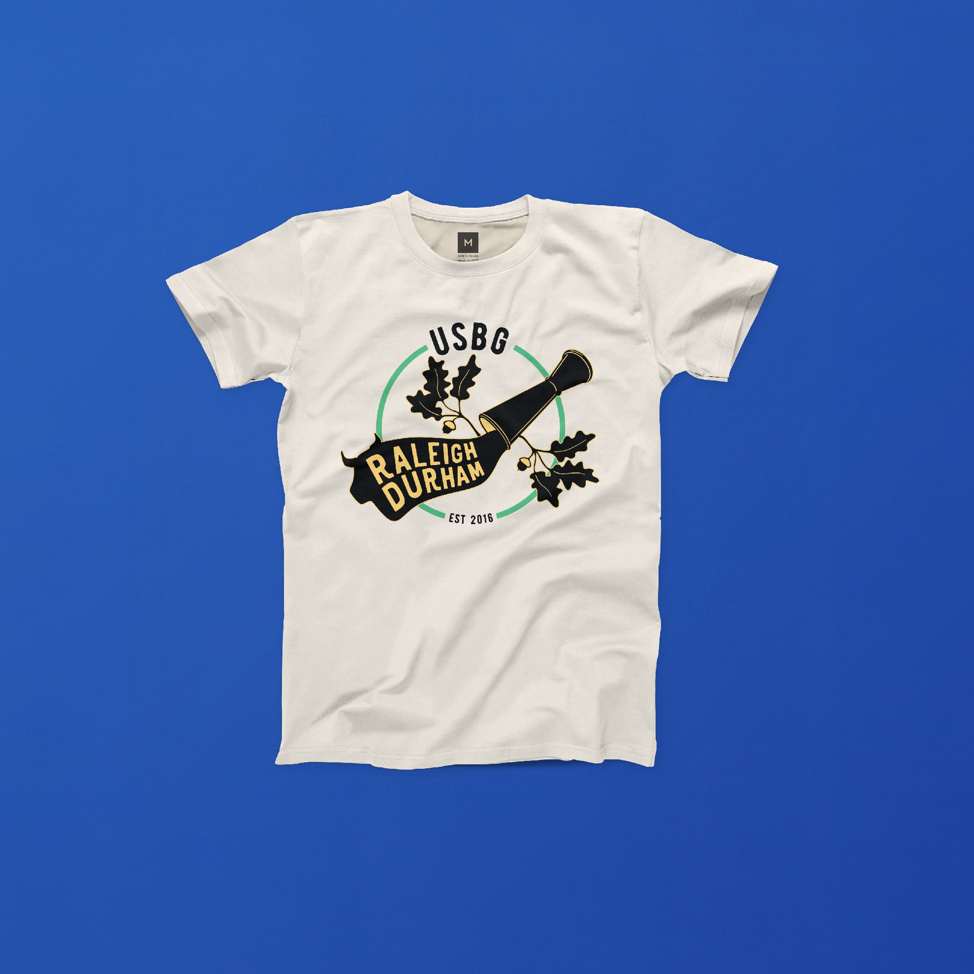
The vibrant color palette draws inspiration from the flags of both Raleigh and Durham, with a primary focus on the yellow and green hues reminiscent of citrus fruits like lemons and limes, commonly used as cocktail garnishes. Crafting this branding system was an enjoyable journey, resulting in a bright and engaging representation of two communities uniting to advance their careers and mutual support.

ourwork-usbg-color-palette
ourwork-usbg-promo04
ourwork-usbg-promo05

The symbolism within the branding extends beyond the surface. The movement and flow incorporated into the design symbolize the fluidity of bartending, where creativity and precision are in constant motion. By intertwining the visual elements of both cities and the tools of the trade, we aimed to create a visual language that tells a story of unity and progress within the bartending community.

ourwork-usbg-promo06
ourwork-usbg-promo07