Website Redesign
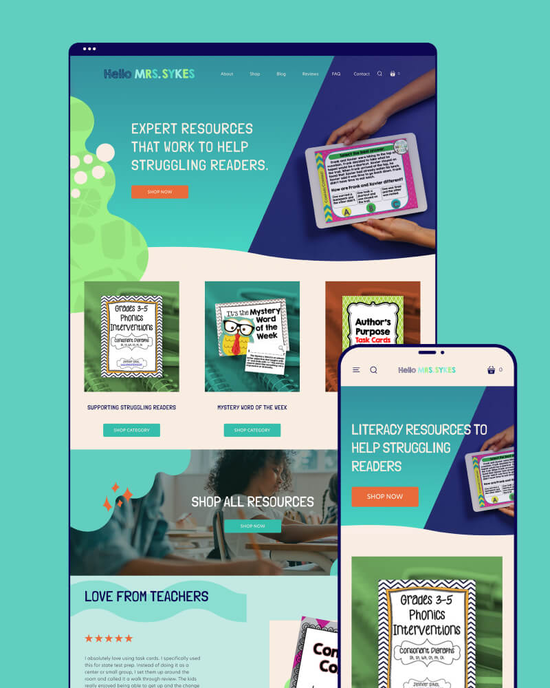
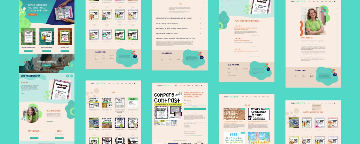
We had the opportunity to design a really fun website for Jennifer Sykes’ store HelloMrsSykes.com, where teachers can get her expert literacy learning materials. She was ready to level up and consolidate from a blog with a separate third-party store on Teachers Pay Teachers to a full e-commerce site.
Brand Refresh
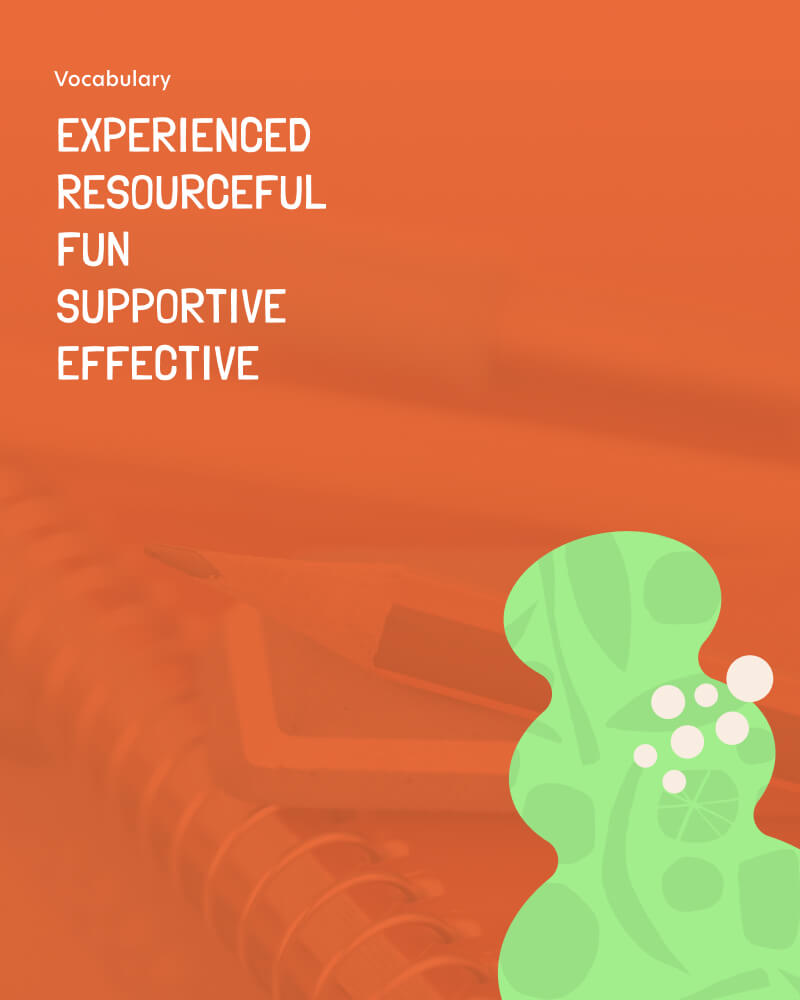
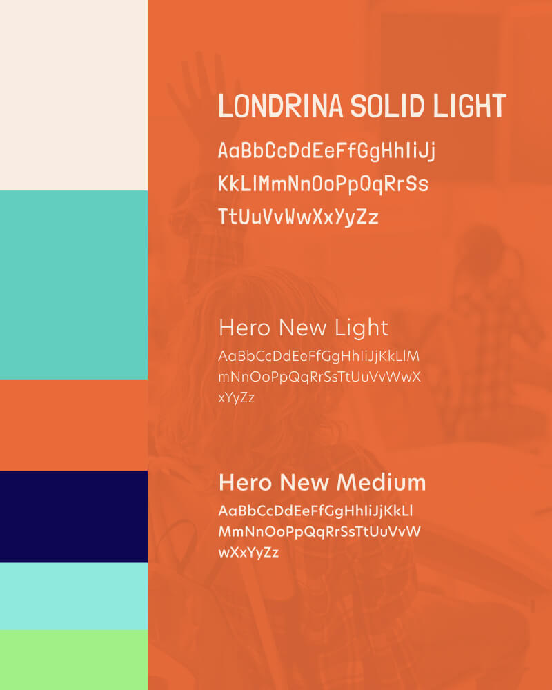
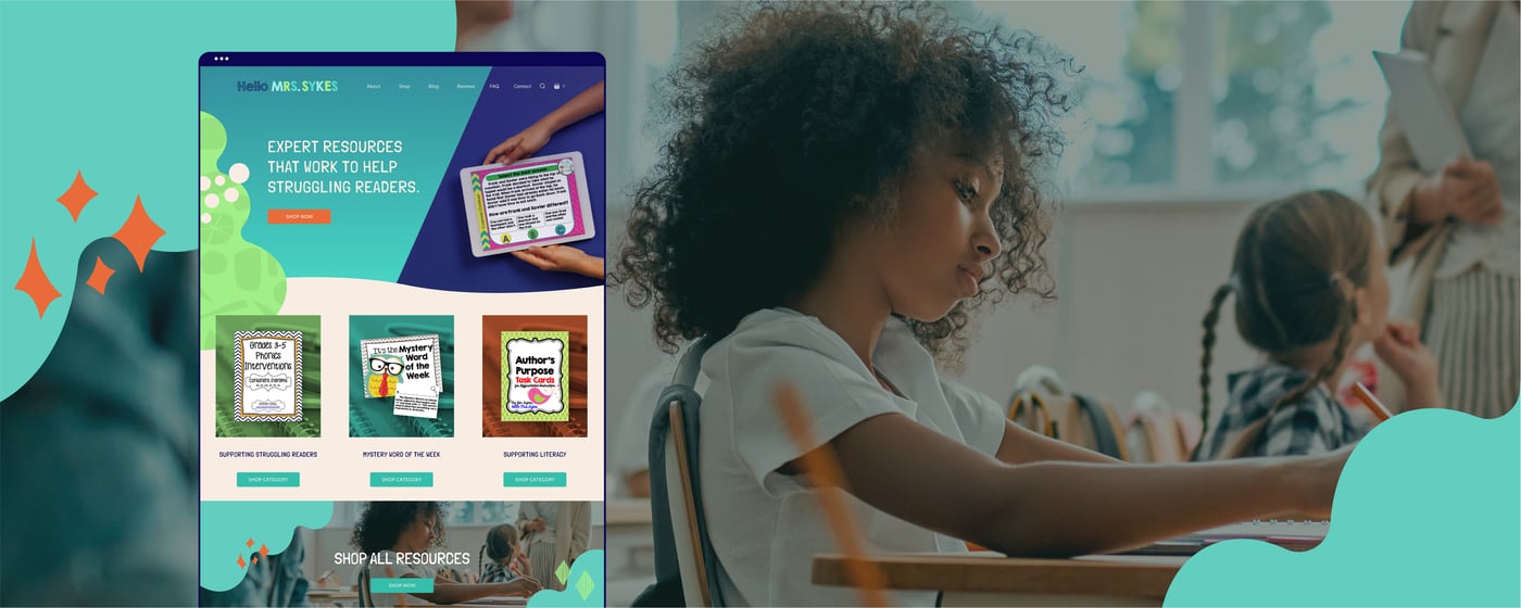
We wanted to use bright colors and shapes to create a sense of fun, but kept them abstract to not fall into the rut of using apples and animals to imply “teacher.” The ideal client is (of course) an adult teacher, but the materials are specialized for grades 3-5, so keeping them fun but targeted to a slightly older age group was a factor we considered in the design process. The kids have to find the materials interesting as well!
We also gave the HelloMrsSykes brand a small update, going for simplicity with the original block letters but using brighter colors.
