ArtCurious

Branding
ourwork-artcurious-header

Rebranding the ArtCurious Podcast

ArtCurious is the brainchild of art historian and podcaster Jennifer Dasal, whose mission is to demystify and infuse excitement into the world of art by revealing its quirky and unconventional side—a facet seldom explored in conventional art history courses.

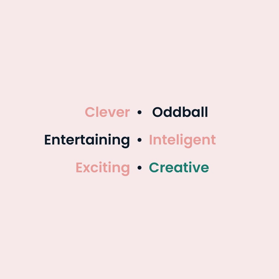
Our collaboration with ArtCurious centered on a brand refresh, aiming to inject new vitality into the existing identity while introducing a layer of symbolism into the wordmark itself. Jennifer's dedication to making art more accessible and enjoyable was the driving force behind this project.

ourwork-artcurious-before
ourwork-artcurious-after
ourwork-artcurious-equation

Our primary goal was to breathe new life into the ArtCurious brand, aligning it with Jennifer's vision for the podcast. We aimed to create a brand identity that not only represented the art world's unconventional aspects but also resonated with a broader audience. To achieve this, we explored innovative design elements and a symbolic logo that would encapsulate Jennifer's aspiration for her audience—to scrutinize art and delve into the stories behind the artists.

ourwork-artcurious-jennifer-dasal

The color palette we developed for ArtCurious was inspired by the works of French Impressionist painter Berthe Morisot, particularly her painting "Jeune Fille au Manteau Vert." We drew inspiration from the subtle color palettes of the Impressionists, pairing them with the dark, rich contrasting tones of the era. The brand's symbol—an amalgamation of a magnifying glass and an eye—embodied our desire to encourage people to explore art more closely, highlighting the stories concealed within the paintings.

ourwork-artcurious-color-palette
ourwork-artcurious-promo01
ourwork-artcurious-promo02
ourwork-artcurious-promo03
ourwork-artcurious-promo04
ourwork-artcurious-promo05
ourwork-artcurious-promo07