Collaborating on Poplar's Brand Identity
We worked with Poplar Development Group to establish a brand identity that is meaningful and long-lasting. Working with the team at Poplar to uncover their brand and the story behind it was so much fun.
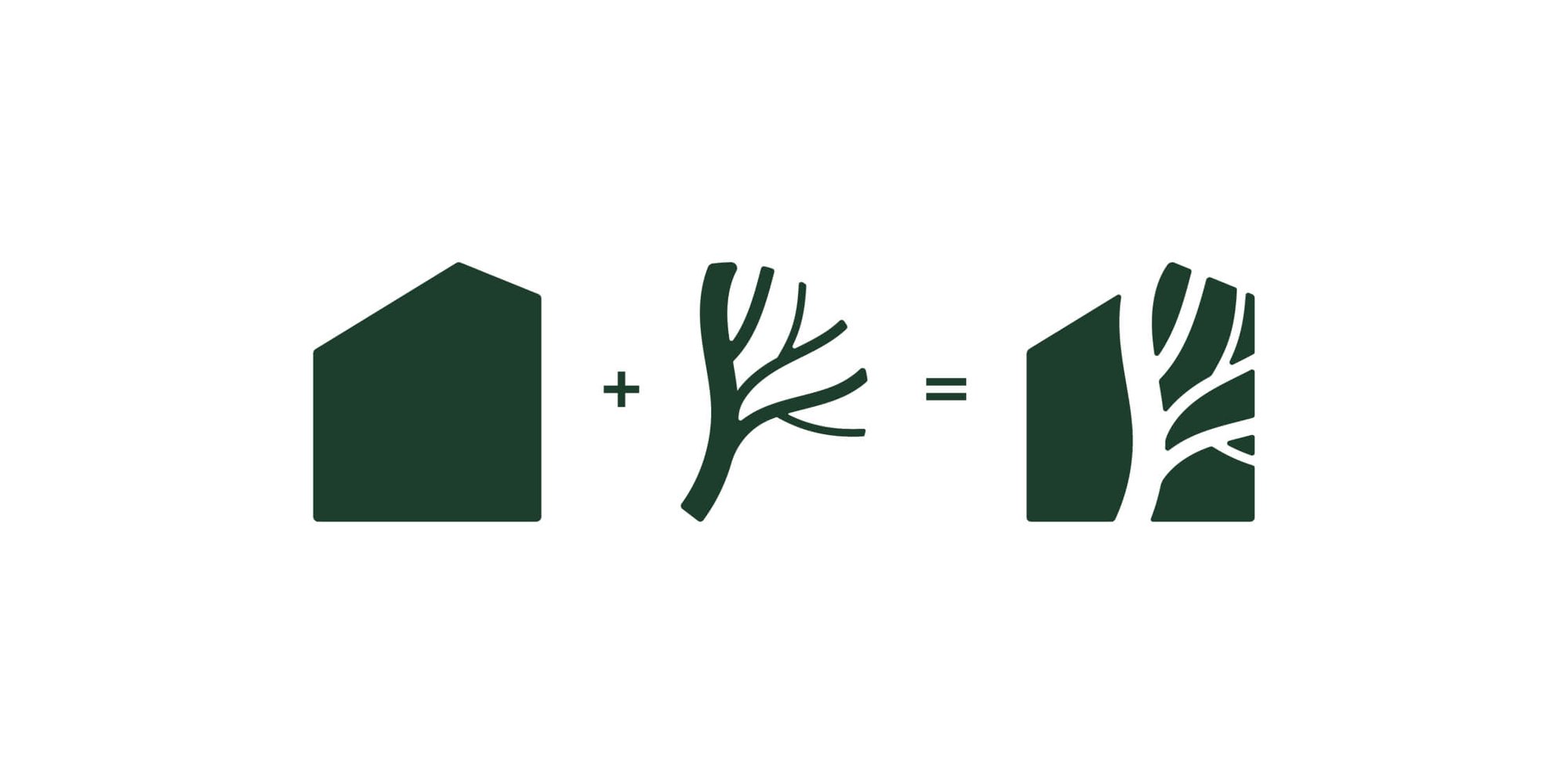
The two business partners have a long history of working within sustainable development and affordable housing. They know each other from their college days at University of North Carolina, where they both got to look out on the historic Davie Poplar while in classes. We wanted to work a similar tree shape and window-like design that played on natural elements for the shape of the logo mark.

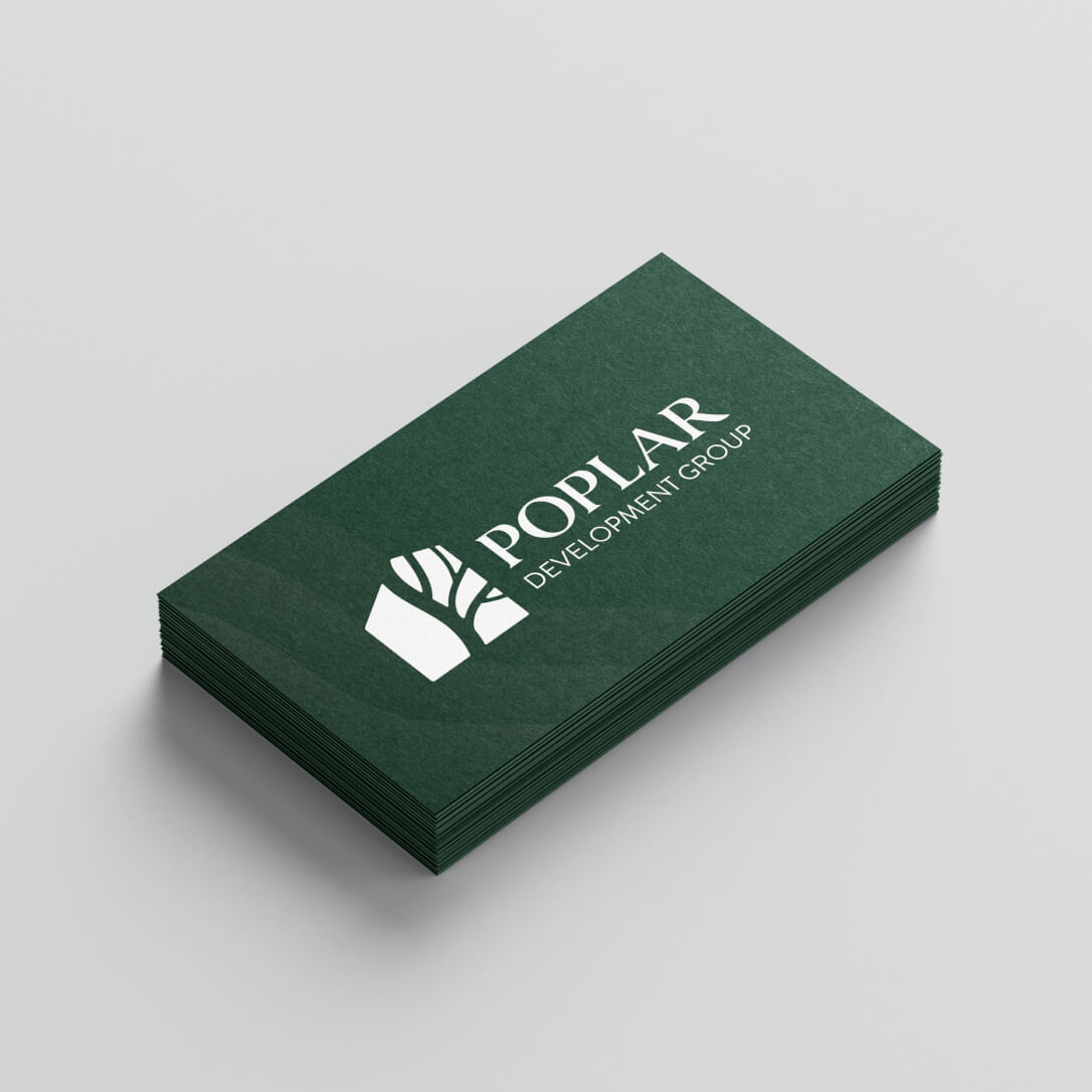
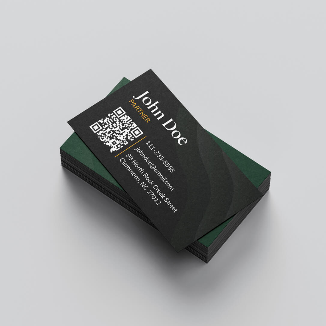
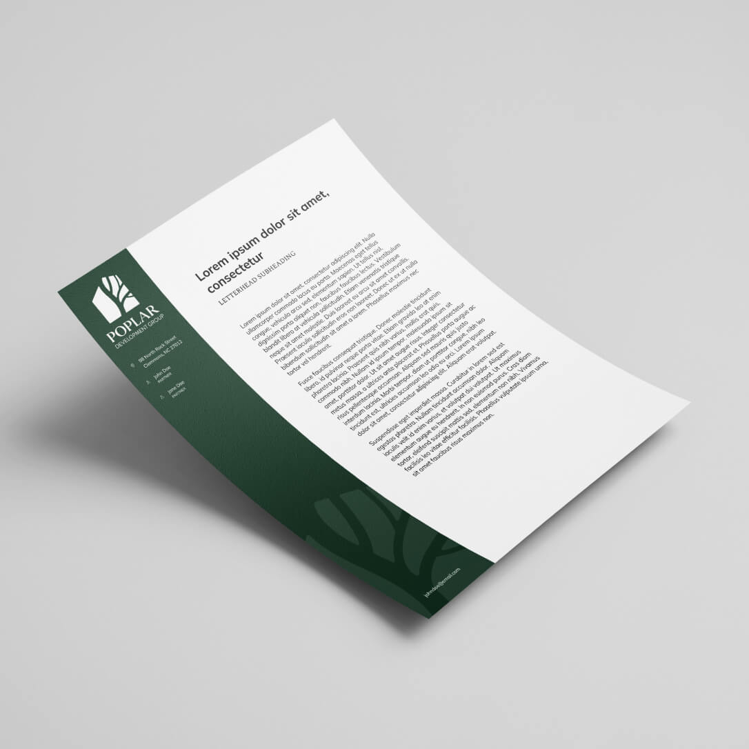

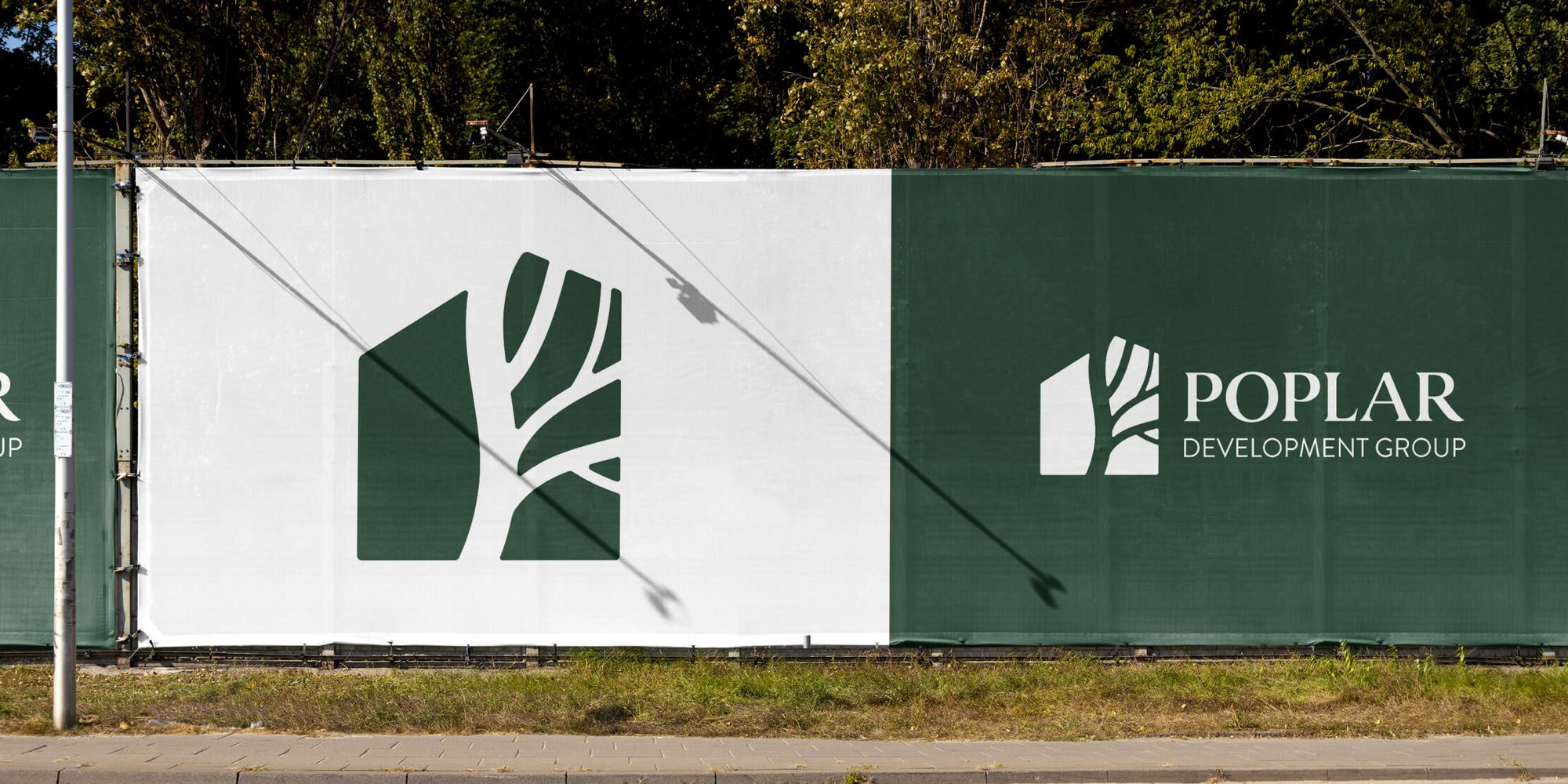
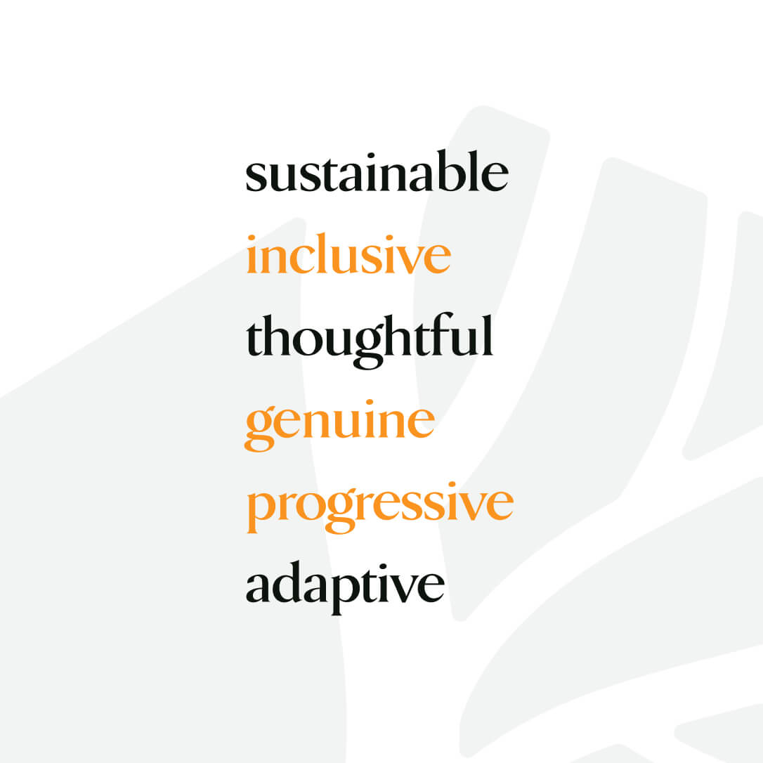
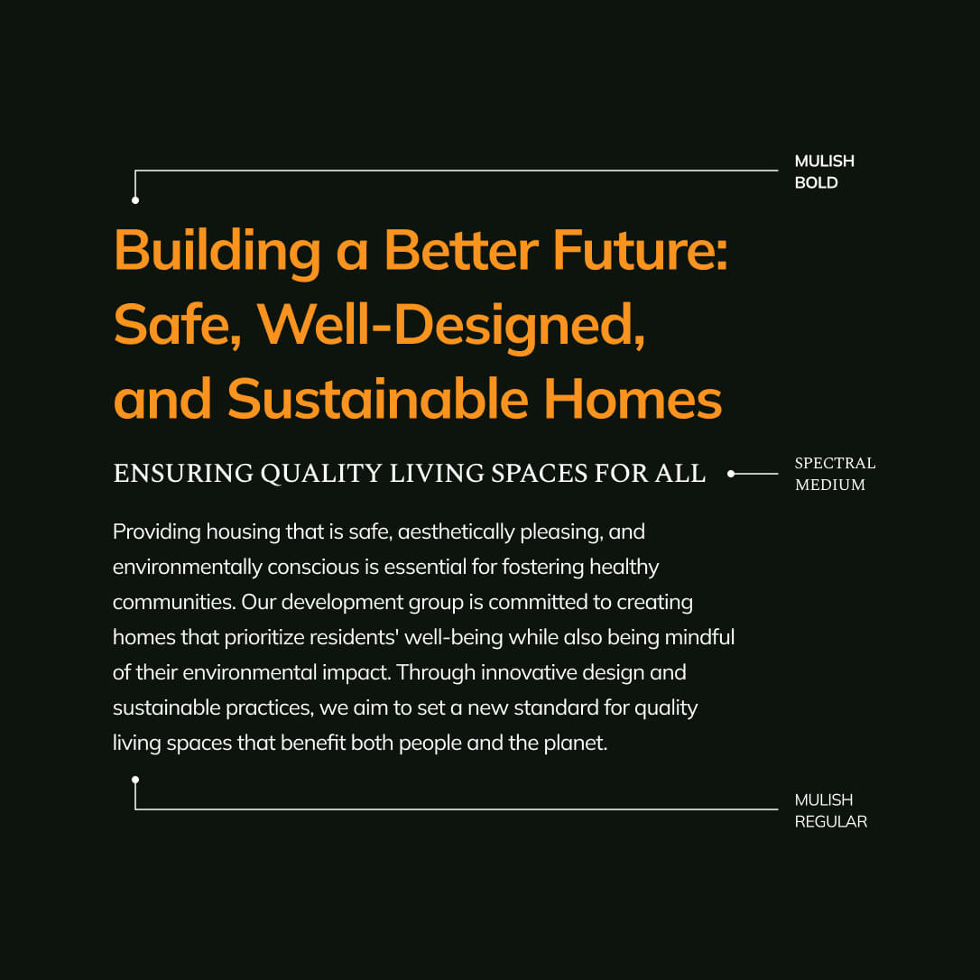
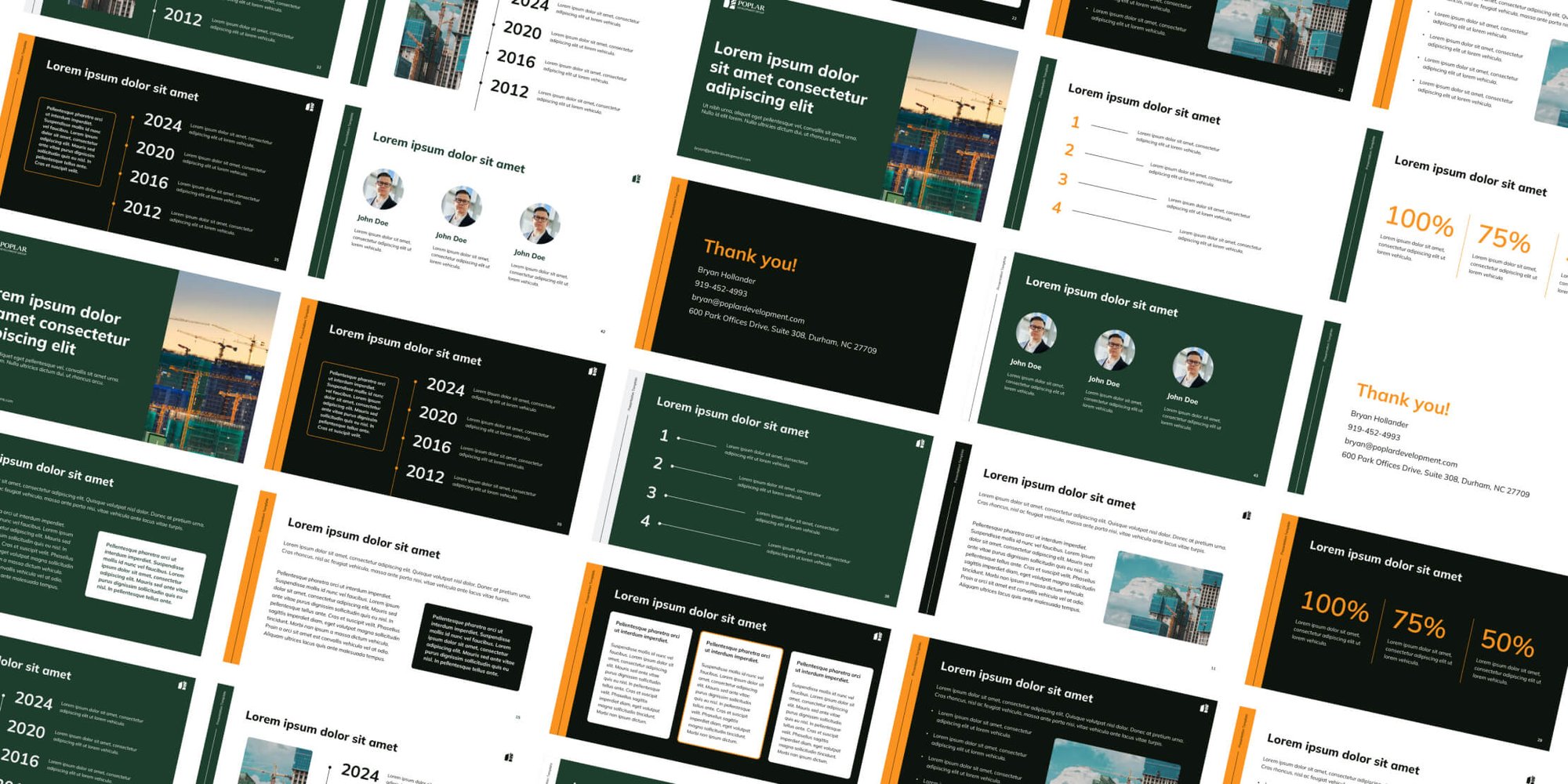
In our collaboration, we worked with the folks at Poplar to come up with key words that described their brand. In our conversations, they showed us how committed and genuine they were to their work within communities to provide environmentally sustainable and economically affordable housing. Part of creating that brand was choosing colors and a typeface that expresses thoughtful precision and hard work. We wanted to make sure we spread that look throughout all their brand collateral for a cohesive feel.
